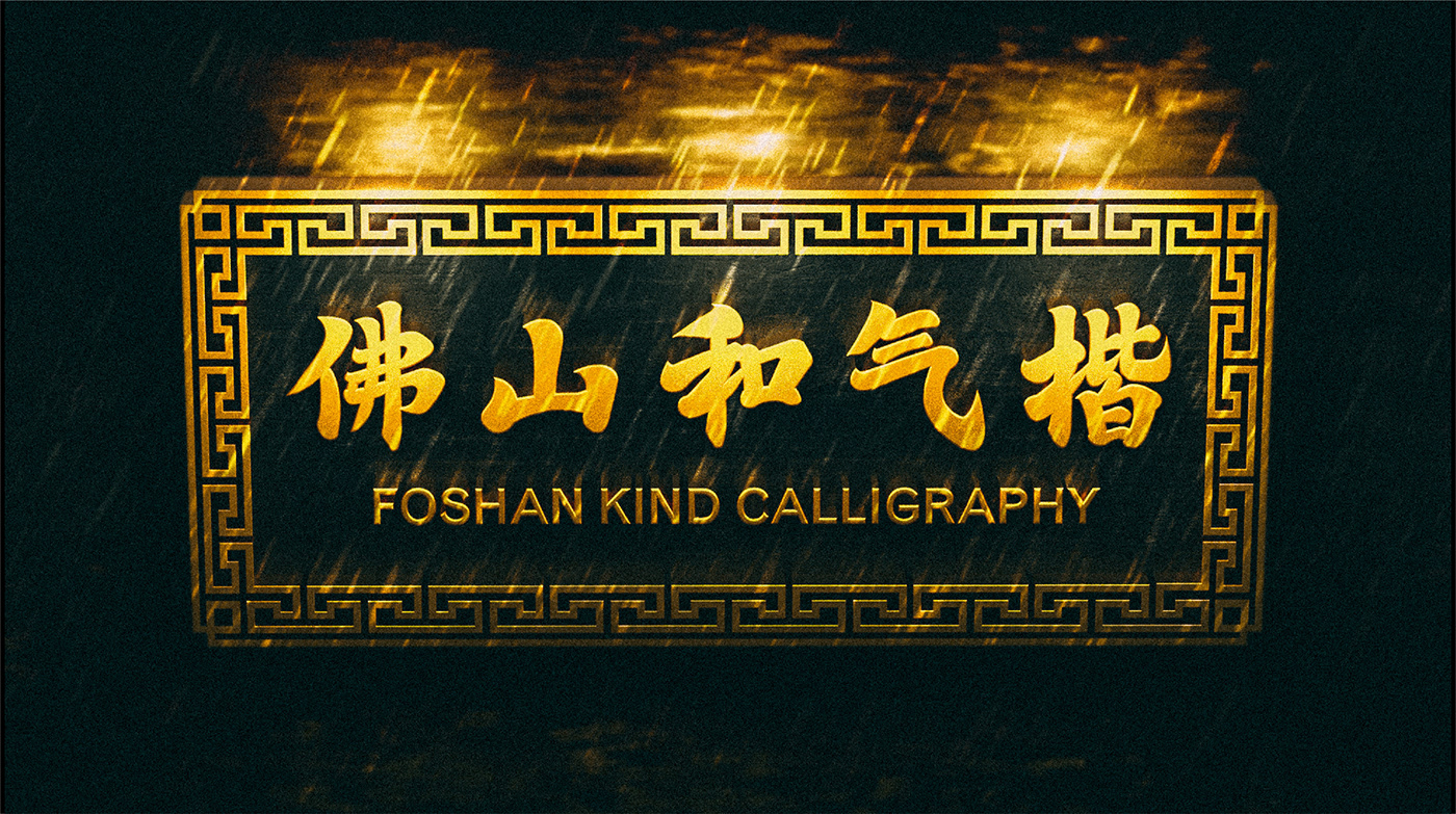
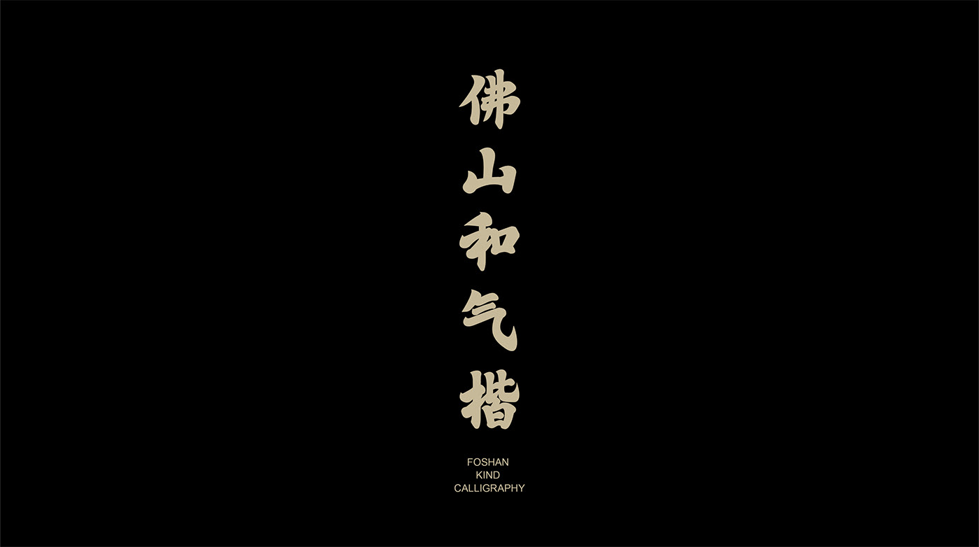
以功夫和書法融合作為理念的字庫字體設計。筆畫設計上參考了佛山著名的詠春拳,最後濃縮成了一個圖形視覺語言。而字體的骨架則來自佛山寫字師傅李海先生的行楷風格書法字,集王羲之和歐體風格於一身。佛山和氣楷的字體結構穩重、中宮緊湊、筆畫收放有度,像功夫一樣一招一式,有板有眼,兼具美學和實用性。
A font design with the fusion of kung fu and calligraphy as the concept. The strokes are designed with reference to the famous Wing Chun fist of Foshan, and finally condensed into a graphic visual language. And the skeleton of the font comes from Foshan writing master Mr. Li Hai's calligraphic characters in the line style, which combines the styles of Wang Xizhi and Ou Shi. With its steady structure, compact middle palace, and measured strokes, the Foshan He Qi Regular Script is both aesthetic and practical, like a kung fu style with a single move and a board,Both aesthetic and practical.
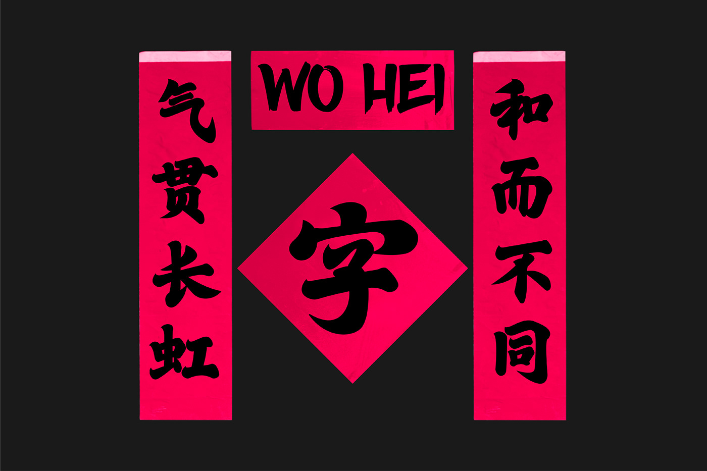
「佛山和氣楷」的創作期待能成為一個載體,再一次把中國功夫的精氣神凝聚起來,願看到字體的人能感受到“力量、正義、骨氣、情義”。功夫教會我們最重要的東西是傳承,我們希望通過字體設計來做到,同時也給中文字型市場帶來多一個選擇,讓更多人去使用這款字體。
The creation of the "FOSHAN KIND CALLIGRAPHY" is expected to serve as a vehicle,once again, the essence of Chinese kung fu is united, and I hope those who see the characters can feel "strength, justice, backbone and righteousness".Kung Fu has taught us that the most important thing is to pass it on, and we hope to do that through the font design, and at the same time bring an additional choice to the Chinese font market, so that more people can use this font.